Preparing the FramesAt his point we have everything we need to prepare our frames. Let's start with opening index.html file. This is the first page when a visitor comes to our site is going to see. Also this is the main page which is going to hold all information about our frames. We need to tell this page we need a frame set with two frames in it.First step is to make this page ready to edit in table mode. Be careful it is not the layout mode we will use. Which one? Check the Figure below to see how to enter Frame editing mode. 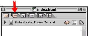
Figure 6: Choosing Frame Editor. It is time to choose Frames from Objects panel. See the Figure 7, below. 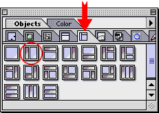
Figure 7: Choosing Frames from Objects panel. Now, drag and drop this object (one with the red circle) to index.html page (this page should be in the frame editing mode) After drag and drop, index.html page should look smilar to this: 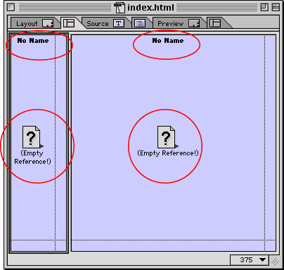
Figure 8: Frames in index.html page. Let's check the big frame on the right. This frame has two circles with same labels like the frame on the left. That means this frame also needs a page reference to show it, and a name to make it easier to separate from other frame(s). I called this frame Content. Now, let's start with the navigation frame. Click inside the left frame, this will activate the inspector window of this frame. It looks like this: 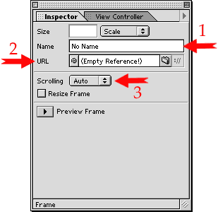
Figure 9: Inspector window of left frame. Step 2. Point and shoot from URL to buttons.html file. Step 3. Choose No from Scrooling options. Our navigation has only three buttons therefore no need to scrool it. At this point you should see something like Figure 10 on your screen. Red arrow on top-right of this figure is pointing Frame Preview mode. Now click on this to see a preview of your navigation frame. You should see the three buttons in this frame, do not click them yet. This buttons might be too big for this frame, you probably can not see them completly; that's why there is a second arrow pointing the bar between two frames. You can click on this bar to choose it then move to left or right to adjust the size of your frames. Please adjust your frames so buttons can fit in the navigation Frame nicely. 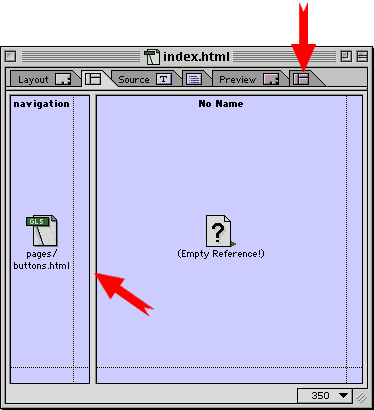
Figure 10: Frame preview and sizing. 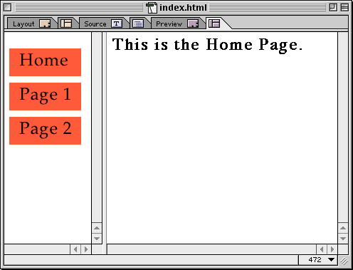
Figure 11: Frame preview. Did you see what happen? OK. time to get back to work. Open buttons.html file by double clicking, and choose the home button *. At the inspector window of home button click on the Link tab. Now check the igure 12 below. 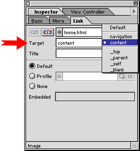
Figure 12: Choosing the target frame for Home button. Thats it ! We just finished our first Framed web site. Go to preview in browser and check all the buttons. If you like to see it in action click here. * An alternative way to open HTML files in Frames is just to double click on them in the Frame editing mode. Ups and Downs of FramesUp : Frames are great for navigation. You only need to set your menus once. All other content pages will be controlled by just one menu system. Saves a lot of work.Up : Since most menu systems in the frames don't scrool, visitors can reach menus any time without going top or buttom of long pages. Down: Some search engine spiders are not very good with following links inside the frames. This might affect your listings in the search engines. One solution is designing an alternative page for search engines and also you should consider visitors with old browsers which are not compatible with frames. Down: If you have a site, making money by banner ads, frames is not a good strategy for you. As I explain above; by giving your visitors a menu which is accessible all the time, you let them avoid from scrooling, therefore missing ads between top and buttom of your pages. Frames are great, if you plan them very carefully. Spending more time
on planning, will help you to balance the ups and downs of Frames. They
are also quite fun to design.
|
|||