Understanding FramesThis tutorial is written to give some basic idea about designing web pages with frames, to web developers and designers. Original title of this tutorial was "Cons and Pros of Frames". To be able to follow the examples; you should have Adobe GoLive and be familiar with the basics of GoLive's interface.What is Frame ?Frames are one of the most used technique in web page design today. It has many advantages and some disadvantages. Details of this will be explained at the end of this tutorial. Should you learn about them? Sooner or later you will meet with a client who needs a web site with frames. So, it is better to be ready than sorry. After all it is a snap in GoLive to design frames.Frames, divide a web page to independent partitions. Each partition behaves like a container which can hold a HTML page. It is something like launch trays can be found almost in every Japanese restaurant. One partition for rice, one partition for chicken teriyaki and another partition for salad. And chef knows which partition is going to hold which meal. As a web designer this is your first step before designing frames to decide what kind of information your frame nests will hold. Frame styled web pages needs meticulous attention in every detail. Carefully planned frame sets are very easy to design and surprisingly easy to maintain. Planning and PreparationLets assume that, you want to have a web site which has two frame nests; one for, navigation services and the other one for content pages. Figure 1 illustrates a simple Frame set with two nests.
Figure 1: Simple Frame set. Since we made a separate partition for our navigation services, we need some sort of buttons, image maps or anything you want to use for navigation. In this example we will use three buttons for navigation which you can see below at Figure 2. Please download them to your desktop now.
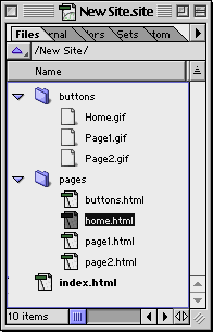
Figure 2: Navigation buttons for left frame. Then create another new folder (Site | New | Folder) and name it, Pages . Now, create four new pages in the Pages folder (Site | New | Page) and name them: page1.html , page2.html , buttons.html and home.html Final site window should look similar like Figure 3. 
Figure 3: New site Preparing Navigation PageOur design consists from two Frames. And the left frame is going to hold a HTML page which has navigation elements in it. Our page for this purpose is buttons.html , double click on buttons.html file in the pages folder to start designing.Once you open buttons.html place three images to this page and link each of them to their corresponding pages. Use point and shoot to link :

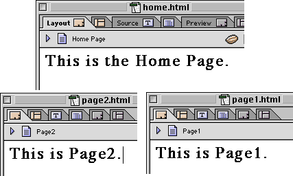
Figure 4: buttons.html page. It is a good idea to put some content in the home.html , page1.html and page2.html pages so we can understand where we are when we navigate through site. Double click to home.html file and write: This is the Home Page. or anything else you want just make sure it tells you which page it is. (Make it header 1 to increase visibility) Double click and open page1.html file and write: This is Page1. (Make it header 1 to increase visibility) Double click and open page2.html file and write: This is Page2. (Make it header 1 to increase visibility) They should look like these: 
Figure 5: Preparing some content in pages. |
||||||||||||